Case study · luxury e-commerce · Shopify · 2025–2026

Fine jewelry needs a storefront that feels rare.
I engineered that experience on top of Shopify.

Logan Hollowell is a celestial fine-jewelry brand of one-of-a-kind stones and made-to-order pieces. I was brought on for accessibility and ended up owning the engineering side of the storefront: the Shopify front-end, a design system built into accessible reusable components, and the product and checkout work, across a 2025 to 2026 rebuild the design team led.

Role: Senior Product Design Engineer Company: Logan Hollowell Jewelry Platform: Shopify · Liquid + sections Scope: Accessibility · front-end · design system · PDP + checkout Year: 2025–2026

The problem

A brand of one-of-a-kind pieces, on a storefront that sold them like a generic catalog

Logan Hollowell's pieces are deeply personal: celestial symbolism, one-of-a-kind stones, made to order. The old storefront sold products, but it didn't carry any of that story, and it wasn't built to be used by everyone. Shoppers arriving from social campaigns landed on dense collection grids, the path from discovery to checkout was built for a generic catalog rather than a considered, high-intent purchase, and accessibility had been an afterthought.

The design team had reimagined the whole journey, from first impression to post-purchase, into something that felt like the jewelry: rare, intentional, and worth the price. My job was to make that real on Shopify, keep it accessible to everyone, and not let the platform's defaults flatten it back into a catalog.

Visual

The storefront didn't feel like the jewelry

Dense product grids and a generic catalog layout. Nothing on the page communicated one-of-a-kind stones, celestial design, or made-to-order craft, so a piece worth thousands looked like any other add-to-cart.

Accessibility

Not built to be used by everyone

Accessibility had been bolted on, not built in. On a store selling five-figure pieces, an experience that fails keyboard users, screen readers, or low-contrast vision is both the wrong thing to ship and a real legal exposure for the business.

Engineering

The design vision had to survive Shopify

The redesign was editorial and immersive. Shopify's theme defaults are not. Getting large photography, per-piece storytelling, and a calm checkout to feel premium meant engineering around the platform, not just theming it.


The constraint

Editorial, immersive, and accessible, on a platform built for speed and standardization

Everything had to ship on Shopify, and the merchandising team had to be able to run it after launch without a developer. That ruled out a bespoke headless build and put the real work inside Shopify's sections, blocks, and metafields. The brief was a luxury, editorial experience: big photography, a story on every product, made-to-order clarity, and accessible to everyone. The platform is optimized for fast, standardized catalogs. Most of the engineering was closing that gap, giving the design its immersive feel while keeping the store fast, accessible, and editable by the team.


The decisions

Three calls that shaped the build

These are the points where I had credible options to choose between. For each one I've laid out what was on the table, why I picked what I did, and what it cost.

Decision 01

Build the design system in code, and make it accessible by default.

The options on the table

  1. 01 Theme each page as it comes, and add accessibility fixes later when something gets flagged. Fastest to a first screen, and how most stores end up with an accessibility retrofit that never quite finishes.
  2. 02 Build reusable components, but treat accessibility as a separate pass at the end. Cleaner, but that pass always gets squeezed by the launch date.
  3. 03 Build one token-based library of Shopify sections and components, with keyboard support, focus states, semantics, and contrast baked into each one, then assemble every page from those accessible parts.

Why this one

Accessibility is what I was originally brought in for, and the lesson from every site that bolts it on later is that it never really gets done. So I built it in at the component level: if the button, the card, the menu, and the product media are accessible by default, then every page assembled from them inherits that, and a new template can't quietly ship an inaccessible pattern. The same library that kept the brand visually consistent across dozens of templates is what kept it accessible across all of them. Doing both in one system, rather than as two separate efforts, is the whole point.

The trade-off

Building accessibility into every component up front is slower than shipping first and auditing later, and some of the work is invisible until someone navigates with a keyboard or a screen reader. It's worth it because accessibility done at the end is a pile of one-off fixes that regress the moment someone adds a page. Done in the system, it holds.

Decision 02

Make the product page an editorial template the merchandising team can run themselves.

The options on the table

  1. 01 Use Shopify's default product template with a bigger image. Ships immediately, but every one-of-a-kind piece gets the same generic layout and no story.
  2. 02 Hard-code a custom layout per hero product. Beautiful for a few pieces, but it doesn't scale to a catalog and needs a developer for every change.
  3. 03 Build one editorial PDP as a flexible Shopify section: immersive photography, the story behind the design, material and sizing guidance up front, made-to-order timelines, and a calm add-to-cart, all editable per product through blocks and metafields.

Why this one

The product page was the heart of the redesign, and for a considered purchase it has to teach before it sells. But the brand adds one-of-a-kind pieces constantly, so a design that needs a developer for every new story is dead on arrival. I built the PDP as a single flexible section: the merchandising team composes each piece's page from blocks (media, story, materials, sizing, made-to-order details) and sets the specifics in metafields. The template gives every piece room for its story, and the team gives it the words, without touching code.

The trade-off

A flexible, block-based section is more work to build and to keep coherent than a fixed layout. It needs guardrails so the freedom doesn't turn into forty inconsistent product pages. I spent real time on sensible defaults and constraints so the easy path is also the on-brand one.

Decision 03

Keep the photography immersive without letting the page get slow.

The options on the table

  1. 01 Ship the full-resolution imagery the brand wanted and accept the load time. Gorgeous on a fast connection, punishing on a phone on cellular, which is where most of the traffic is.
  2. 02 Compress and shrink the imagery until the pages are fast. Quick, but it undercuts the exact thing a luxury jewelry site is selling.
  3. 03 Engineer the media pipeline: responsive and art-directed images sized per breakpoint, prioritized hero loads and lazy everything else, so the imagery stays immersive and the page still feels instant.

Why this one

For fine jewelry, the photography is the product. A spinner or a janky load on a piece worth thousands breaks the spell immediately. But a media-heavy luxury site is exactly the kind that gets slow, and most shoppers arrive on a phone. So the media was an engineering problem, not just an asset drop: responsive sources sized per breakpoint, art direction so the crop is right on mobile, the hero prioritized and the rest lazy-loaded. The goal was for the imagery to feel rich and land fast, on the device most people actually use.

The trade-off

Doing media properly is slower than dropping in images and moving on, and it adds complexity to every template that shows a product. It was worth it because speed is part of the luxury feeling here, not separate from it. A beautiful page that loads slowly reads as cheap.


What I built

The storefront, the accessible system underneath it, and the parts merchandising runs

What I engineered across the rebuild, from the design system up to the pages a shopper touches.

  • Shopify front-end build

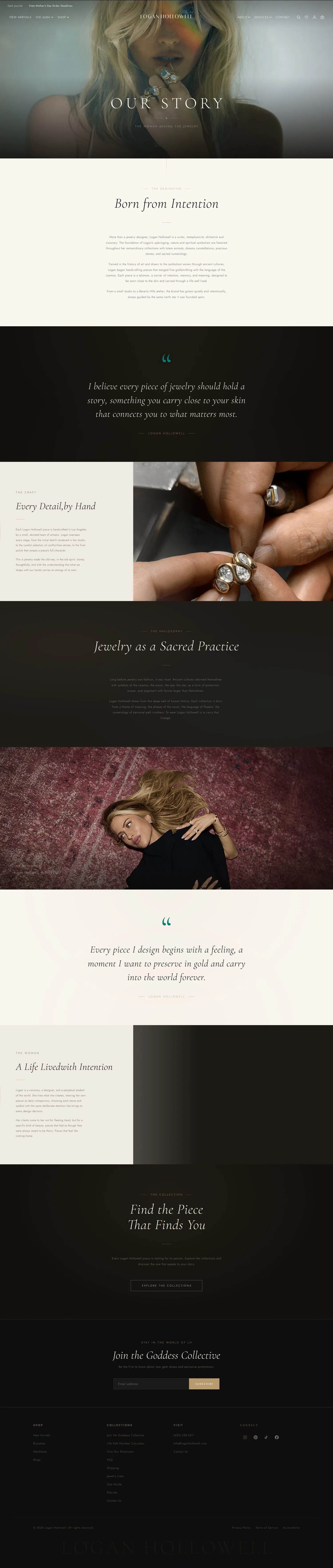
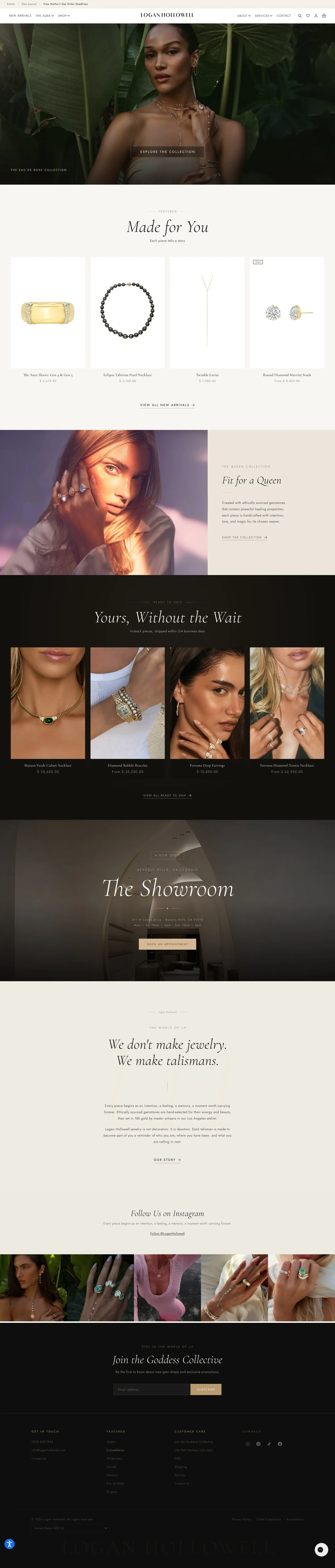
    The full storefront in Shopify: home, collection and catalog pages, the product detail template, brand and story pages, cart, and the checkout surface. Responsive across phone, tablet, and desktop.

  • Accessible design system in code

    A token-based library built out into reusable Shopify sections and components (type scale, spacing, buttons, cards, product media, editorial blocks), with keyboard, focus, semantics, and contrast baked in. It became the brand's design system.

  • Editorial PDP template

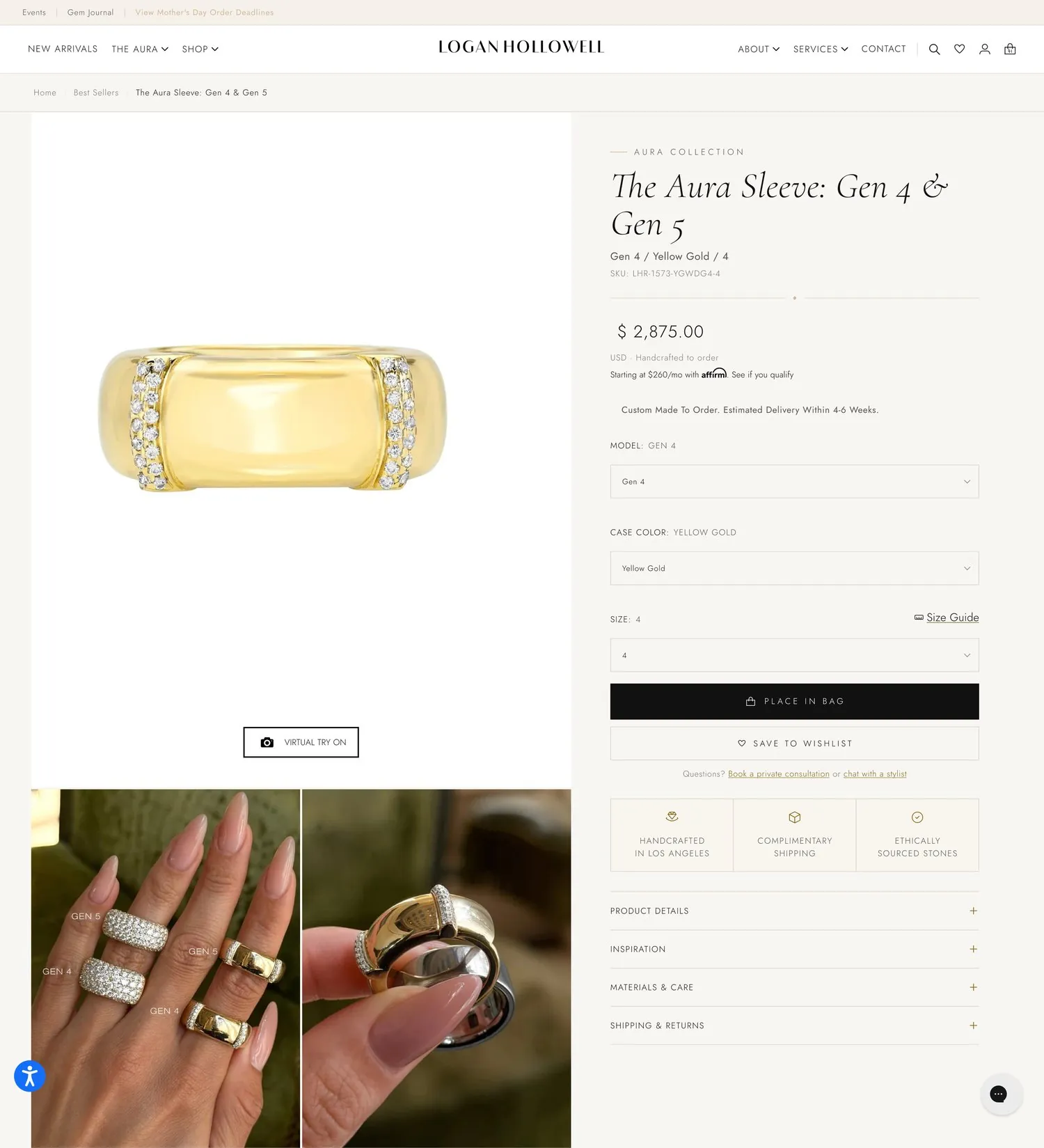
    A flexible product section with immersive photography, per-piece story, material and sizing guidance, made-to-order timelines, and a calm add-to-cart, all composed from blocks and metafields the merchandising team edits without a developer.

  • Wishlist and stylist consultation

    Save-to-wishlist and a book-a-private-consultation and chat-with-a-stylist path on the product page, giving a high-consideration shopper a way to come back and a human touch before a big purchase.

  • Restructured navigation and catalog

    Navigation and collections rebuilt around how people shop, by collection story, gemstone, and occasion, instead of internal product taxonomy, on top of Shopify's collection and tag system.

  • Curated collections and ready-to-ship

    Reusable collection and content templates for the brand's curated and editorial pages, plus a ready-to-ship filter that separates the fast lane from the made-to-order pieces.

  • Checkout clarity and trust cues

    Within Shopify's checkout, shipping and made-to-order timelines surfaced before payment, plus care, returns, and authenticity cues placed where hesitation peaks.

  • Media performance pipeline

    Responsive, art-directed imagery sized per breakpoint, prioritized hero loads, and lazy-loading, so a media-heavy luxury site still feels instant on a phone.

  • Analytics and event instrumentation

    Add-to-cart, checkout, and funnel events instrumented on the new theme, so the team can see how the storefront actually performs and trace a change to UX or tracking instead of guessing.

  • Made-to-order and integrations

    Made-to-order timelines, product options, and the third-party apps the store depends on, wired into the templates so the front-end and the operational reality stay in sync.


What I owned

The engineering side of a design-led rebuild

Accessibility

The reason I was brought in

Keyboard navigation, focus states, contrast, and semantic structure, built into the component library so accessibility is a property of the system rather than a retrofit. This was my original mandate, and it shaped how I built everything else.

Front-end engineering

Built the storefront on Shopify

Every page shipped as real Shopify Liquid, sections, and snippets. I turned the design into a responsive, production storefront the merchandising team runs themselves.

Design system

Built into reusable components

A reusable, token-based component and section library that kept the brand consistent across the store, stayed accessible by default, and became its documented design system.

PDP + performance

Engineered the considered-purchase flow

The editorial product template, wishlist and stylist-consultation paths, and a media pipeline that keeps immersive pages instant on a phone.


The design

A storefront that carries the brand from the first scroll to checkout


The texture

The detail I spent the most time on was making a huge product photo feel instant

The detail I spent the most time on doesn't look like engineering. It's how fast a giant product photo appears. On a fine-jewelry site the photography is the product, and the whole promise is that the piece is rare and worth the price. A spinner, a layout shift, or a blurry placeholder that snaps into focus half a second late quietly says the opposite. So the product media got treated as its own engineering problem, not an asset I dropped into a template.

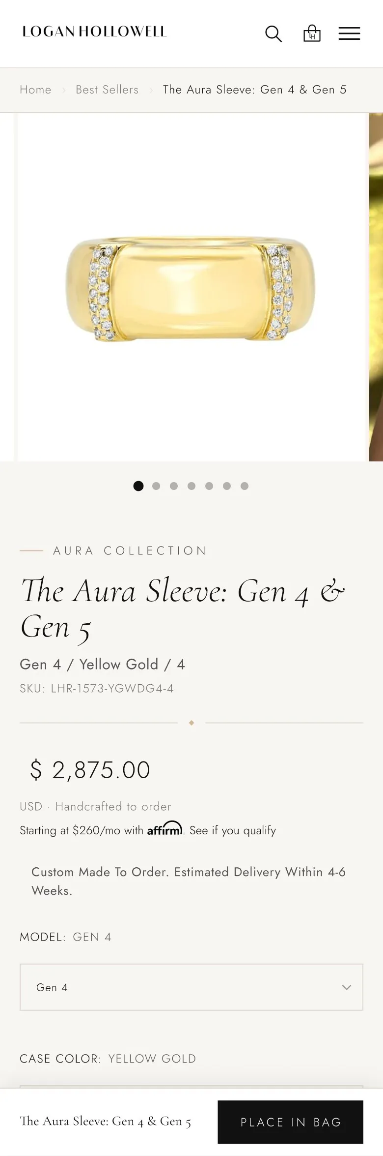
That meant responsive sources sized for each breakpoint instead of shipping one huge file to a phone, art direction so the mobile crop frames the stone rather than a corner of it, the hero image prioritized so it paints first, and everything below it lazy-loaded so it never competes. On a made-to-order piece that costs as much as a used car, the experience has to feel as considered as the purchase, and most of that consideration is happening on a phone on cellular.

It looks like the photo just loads. That is the point. The work was invisible on purpose, because the moment you notice the engineering on a luxury site, the luxury is already gone.


Impact

What shipped, and what it set up

2025–26
Full Shopify storefront, redesigned and shipped
home · collections · product · brand pages
WCAG
Accessibility built into every component
keyboard, focus, semantics, contrast
1
Design system, built into reusable components
the parts every page is assembled from
Live
Running on loganhollowell.com
built for the team to edit, without a developer

The rebuild shipped as a full Shopify storefront that carries the brand's celestial identity from the first scroll to checkout: a reorganized catalog, an editorial product template that gives every piece its story, wishlist and stylist-consultation paths for high-consideration buyers, a calmer checkout with trust cues, and a media pipeline that keeps it all fast. Underneath, an accessible design system in code kept the brand consistent and usable by everyone, and became its own documented piece of work. Detailed conversion and revenue figures are available on request.

I was originally brought onto Logan Hollowell for accessibility, and grew into the engineering side of the rebuild. Design direction came from the product-design lead and the design team. The front-end build, the accessible design system in code, the PDP and checkout engineering, the media performance work, and the UX and UI alongside the design lead were mine. This was a team effort, and this case study covers the engineering side of it.

What this project reinforced about being a design engineer.

On a luxury storefront, the engineering and the brand feeling are the same thing. Speed, image quality, a calm checkout, an accessible component: none of those are separate from whether the experience feels worth the price. They are how it feels worth it. The most valuable thing I did wasn't a single feature. It was building the system underneath, accessible by default, so that every page, present and future, inherited the same quality instead of depending on someone remembering to add it.

Why design and engineering worked better as one loop.

The design lead reimagined the journey, and I built it. But it wasn't a handoff. Living in the code meant I could tell early which parts of the vision Shopify would give us cleanly and which would fight back, and we adjusted the design around that instead of discovering it at the end. Sitting in both the UX and the implementation is what kept the shipped storefront feeling like the intent, not a compromised version of it.

What's next.

The open question is the checkout. Top-of-funnel got healthier after launch, but completion is harder to read, and the honest first job is separating a real UX drop from a tracking gap on the new theme before anyone claims a win or fixes the wrong thing. I instrumented the funnel for exactly that reason. Closing that question cleanly, with real numbers, is the next piece of work, and it's the kind of thing I'd rather get right than round up.